Zomato : A food and Dinning app at Microsoft App Store. It recommends the best eat outs at your location.
This review is from the point of view of a developer.
Zomato : On installation it creates a wide tile on the screen. ( Point :1/1)
Zomato uses your location , so it uses Internet Capability.(Point : 1/1)
Splash Screen is elegant and the application loads very quickly. (1/1)
The
Home Page is good:(1.6/2)
a. The layout is done with perfectness .
b. has both in-app live tiles and static tiles.
c. User Management is placed properly
d. There is no horizontal space bar placed for a small screen monitor. User has to browse to the user management part manually. This is a big drawback I see on the home screen.
e. The location of the user is found in the app loading time itself , the user can still change the location.
f. The location has been neatly shown as an expandable drop-down.
g. On changing the location the leader board tile and featured hotels, featured reviews etc tile changes within no time.
I give (1.6/2) for the home page.
0.4 is deducted for not providing the horizontal scroll bar.
User Management Module:(2/2)
The user management module has come beautifully on this app.
a. You can login using facebook and Google APIs.
b. Login and Signup forms are very intuitive.
c. Messages and Notifications are well provided.
I give this module 2/2
BAD : The App closed without me closing it/ or without Alt+F4 key. The app has a button which reads 'ZOMATO' this button is used for going back and on the home screen when I click this button I got logged out. :(
Featured :(2/2)
a. The featured page has come out nicely.
b. The screen is basically divided into four parts:
c. I have a static panel and a scrolling panel on the same page. I liked this concept.
d. Lets start with what this page has:
a. A map : Simple and Straight forward.
b. Review : Simple ,Scrollable. I can read/ write reviews easily.
If I click anywhere on a review a flyout comes,
everything is okay here , but data is not consistent.
If I click on Foodie button , I can see the recent activities of the reviewer.
Now, if I click on the part of the reviewer's Favorite ,we reach the marked restaurant. I liked it.
c. If I click on Photo I get into the flipviewer, its clean and uses the same photo viewer concept as of Windows 8.
d. I can see a static menu for today. Liked this. Easy and Simple.
e. Info has been placed very cleanly.
f. Favorite , mark and footprint are easy to use, but there is no text coming in so it causes a less usable control. I am a new user and don't understand what the three icons mean.
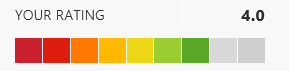
g. The rating control is good and is of lot of use.
h. App Bar is consistent with the page.
e . Thing I don't like here is : I can go back to my previous screen using two different buttons.
Or two buttons do the same thing for me.
Search Module:(1/1)
Search uses the Search Contract of Windows 8.
It uses an in-app Search and shows the search results in a separate page.
We will see on the rest of the modules in the next article.